There’s no more critical point in the ecommerce journey than the checkout page. Until this step, the customer’s commitment is low—they’re digital window shopping. But checkout sets customers apart from visitors; it’s where they decide to buy your product or abandon their cart.
Not only is a good checkout page key to landing a sale, it is crucial for winning repeat customers. In fact, 91% of customers say a satisfying checkout experience means they’ll likely buy from a brand again. Here’s how to optimize your checkout page so you can improve conversion, boost sales and keep customers coming back.
✂️Shortcuts
- What is a checkout page?
- One-page checkout vs. multi-page checkout
- 6 best practices for optimizing checkout pages
- 3 common mistakes to avoid when designing checkout pages
- Checkout pages FAQ
What is a checkout page?
A checkout page is where customers complete transactions on an ecommerce website. It’s where shoppers can review the items they’ve added to their shopping cart, confirm quantities, select shipping options, and specify their payment method. The checkout page is also where the consumer enters—and the store collects—information like billing and shipping addresses to complete the purchase and start the shipping and fulfillment process.
Checkout pages are the final step in the online buying process—the conclusion of the customer journey. The goal of any checkout page is to provide a seamless, user-friendly experience that reduces barriers and lowers shopping cart abandonment rates.
One-page checkout vs. multi-page checkout
A checkout page can be built as a single page (or single click) solution or a step-by-step process spread over multiple pages. The choice between the two depends on various factors, including the complexity of the purchase process, your target audience, and your goals. Here’s how one-page checkout and multi-page checkout differ:
- One-page checkout. One-page checkout speeds up the process by packing all required aspects onto a single page, including cart contents, payment details, contact details, billing and shipping address, and shipping options. One-page checkouts are fast but can be confusing if not designed well or if users are used to multi-page experiences.
- Multi-page checkout. A multi-page checkout divides the checkout process into various steps and pages. To complete the purchase process, customers must go through all pages to input their information and click “buy.” Multi-page checkouts are longer, but allow you to check where the customer left the buying process.
6 best practices for optimizing checkout pages
- Keep the process simple and user-friendly
- Use clear and concise language
- Incorporate trust signals
- Provide multiple payment options
- Allow customers to review their order
- Offer guest checkout
According to data collected by the Baymard Institute, the average ecommerce cart abandonment rate is just under 70%. Cart abandonment varies depending on factors like hidden costs, complex checkout processes, and a lack of payment options.
To reduce cart abandonment, start by following these best practices for optimizing your checkout pages.
1. Keep the process simple and user-friendly
Your entire checkout process should be quick and easy, with minimal distractions and no unnecessary steps. One survey shows 87% of online shoppers abandon their carts if checkout is too complex, and 55% abandon the retailer altogether.
To prevent this, only include form fields for information needed to complete the purchase. Others can either be optional or removed entirely.
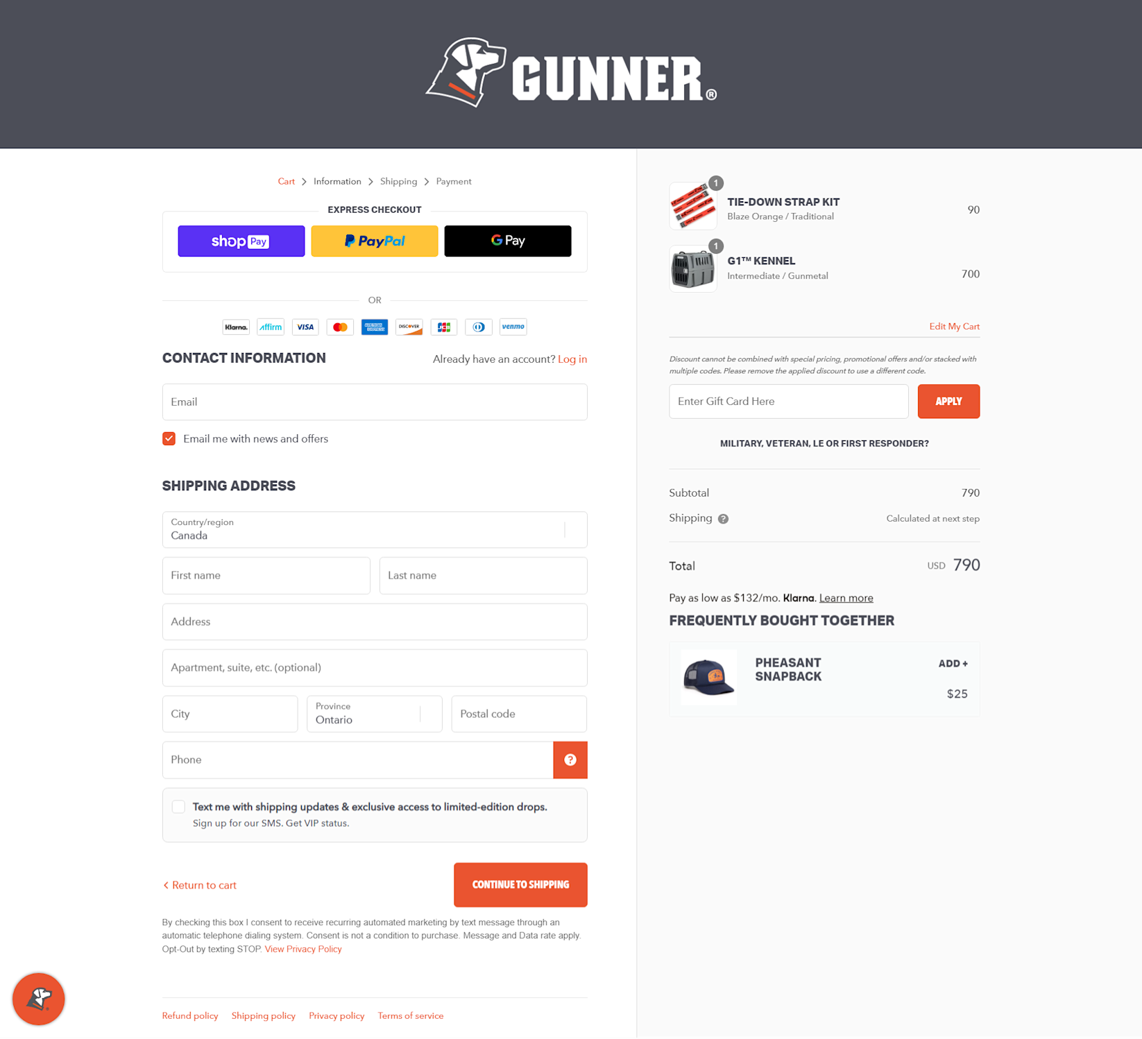
Gunner Kennels’ simple and transparent checkout page makes it easy for customers to input their required information.
Dog kennel brand Gunner Kennels uses minimal form fields, collecting only essential information. Address fields use Google’s autocomplete address form, meaning the city, state, and ZIP code fields are auto-populated when the customer types their street address. Optional information, like the phone number, comes with an information box that explains why you may want to add it.
2. Make navigation easy and intuitive
Checkout copy guides users through the process, and should be short, to the point, and descriptive. Include breadcrumbs to indicate progress, like:
- Step 1: Shipping Information
- Step 2: Payment
A progress bar is useful to show the buyer where they are in the checkout journey and encourage them to continue.
Providing clear calls to action with prominent buttons like Proceed to Checkout or Place Order help guide users through the process.
Sustainable clothing retailer Tentree includes an overview at the top of its checkout page to let users know there are four steps in the checkout process:
- Cart: reviewing your cart
- Information: entering your information
- Shipping: choosing your shipping method and speed
- Payment: entering payment information
3. Incorporate trust signals
Buyers need to trust your ecommerce website. According to a survey by PYMNTS, 92% of customers were extremely satisfied with checkout experiences that used trustmarks. Social proof and security badges are two ways to send trust signals.
Money-back guarantees help build confidence and trust among customers. Star ratings and client reviews of products at checkout give users confidence in the product or service they’re buying. Shopify apps that collect and display reviews include Product Reviews, Judge.me, and Loox.
Security badges like payment badges and SSL certificates reassure customers that their personal and payment information is secure.
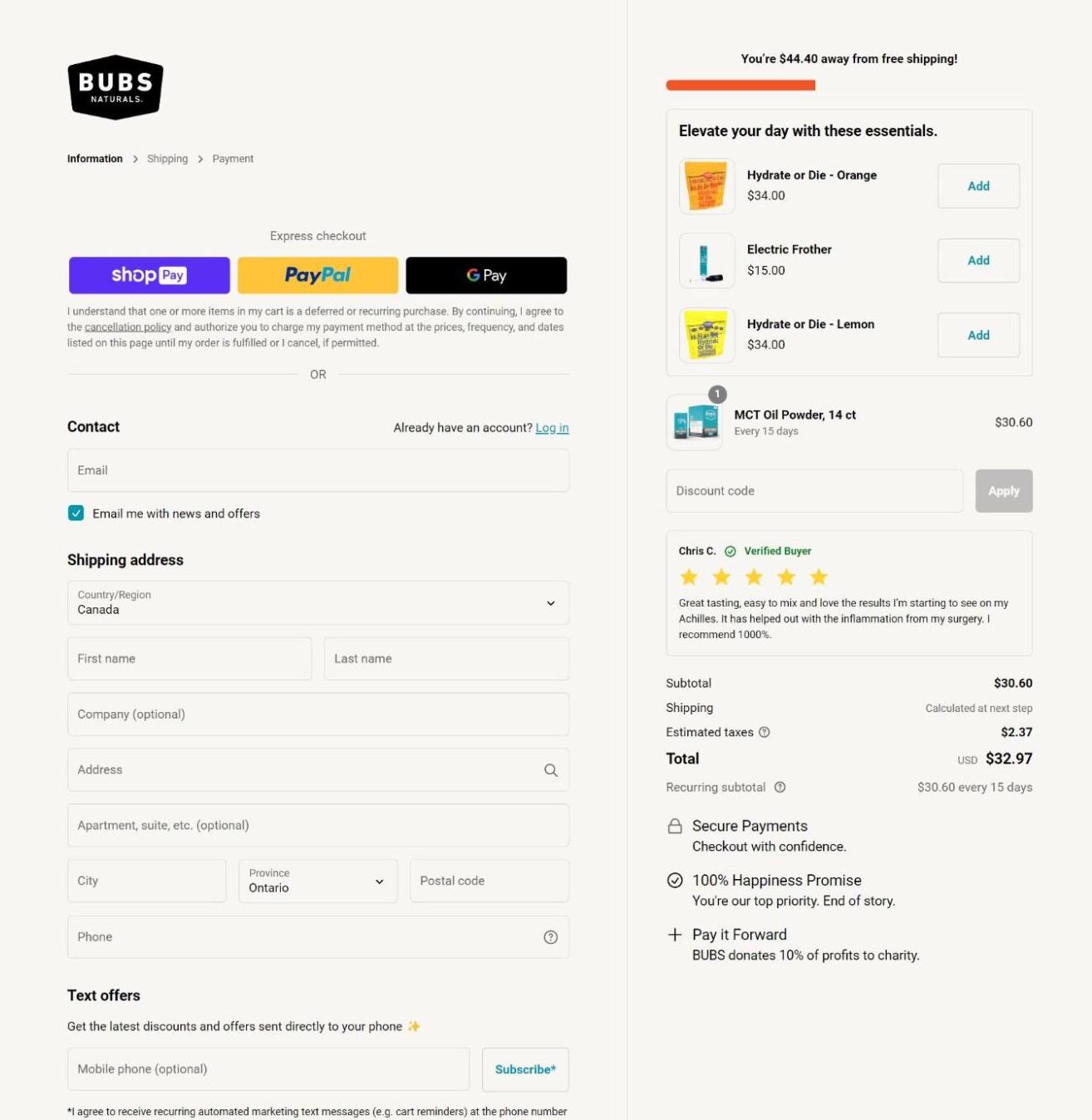
Bubs Naturals has many trust elements on its checkout page, including star ratings and reviews.
Bubs Naturals offers one of the best checkout page examples for trust signals. The vitamins and supplements store uses product reviews, secure payment methods, and a 100% happiness promise on the checkout page. These trustmarks address key customer concerns. It reassures them that their payment is secure, they are buying a quality product, and they can get their money back if they aren’t happy with their purchase.
4. Provide multiple payment options
Buyers want options for paying for products and services online. Forty-two percent of US consumers said they would abandon a purchase if their favorite payment options weren’t available.
Provide a variety of payment methods, such as credit and debit cards, mobile payment solutions (PayPal, Shop Pay, or Apple Pay), digital wallets, and buy now, pay later options to cater to different customer preferences.
When choosing a payment provider, consider the countries where you do business and where your customers live. Shopify’s list of payment gateways offers information on payment methods available in target countries and the currencies they support.
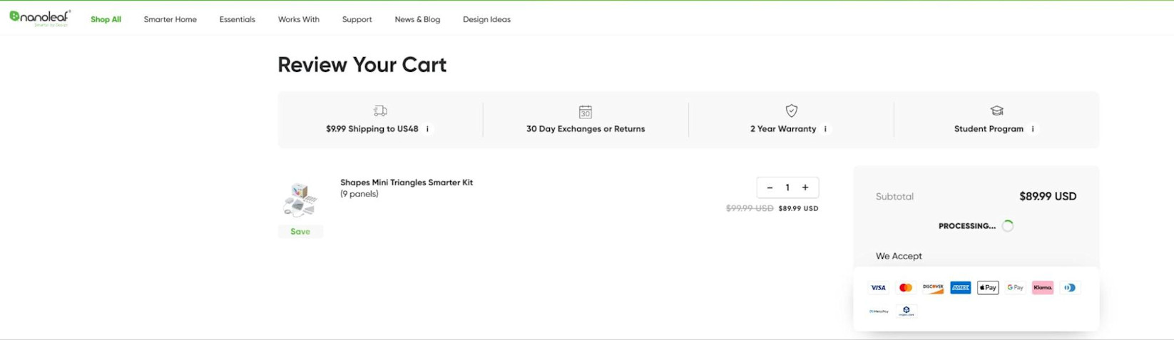
Nanoleaf’s various payment methods make it easy for customers to complete their purchase.
5. Allow customers to review their order
By providing the total cost of the order and the estimated shipping date early in the checkout process, you allow customers to assess if it fits in their budget and will arrive on time.
According to a study by PWC, 29% of shoppers visit sites to compare the total cost of purchase between stores before buying. This means they need to see the total cost of the transaction early in the buying process to help inform their decision.
Display the total cost of the order and estimated shipping times in the cart or checkout, including item prices, taxes, shipping costs and options, and promo codes. Ensure transparency by displaying total costs at each step of checkout. Clearly state if the cart subtotal excludes shipping. Users should know all prices upfront before entering payment information.
Bath bomb brand Happy Hippo uses Shopify checkout to display all relevant costs and shipping fees on a single screen before sending customers to the payment page. As the user fills out information, shipping options and associated costs are added to the purchase total, providing transparency throughout the process.
6. Offer guest checkout
Allowing customers to create an account with your store can smoothen the checkout process for future purchases. Not all users want to take the extra time to create an account, especially if they don’t plan to shop again at your store.
According to a report from PYMNTS, 12% of online shoppers found creating an account to be a major pain point when shopping online.
Giving users the option to check out as guests offers the best of both worlds. Returning customers can quickly check out using their account credentials, while occasional or one-time shoppers can complete the process as a guest.
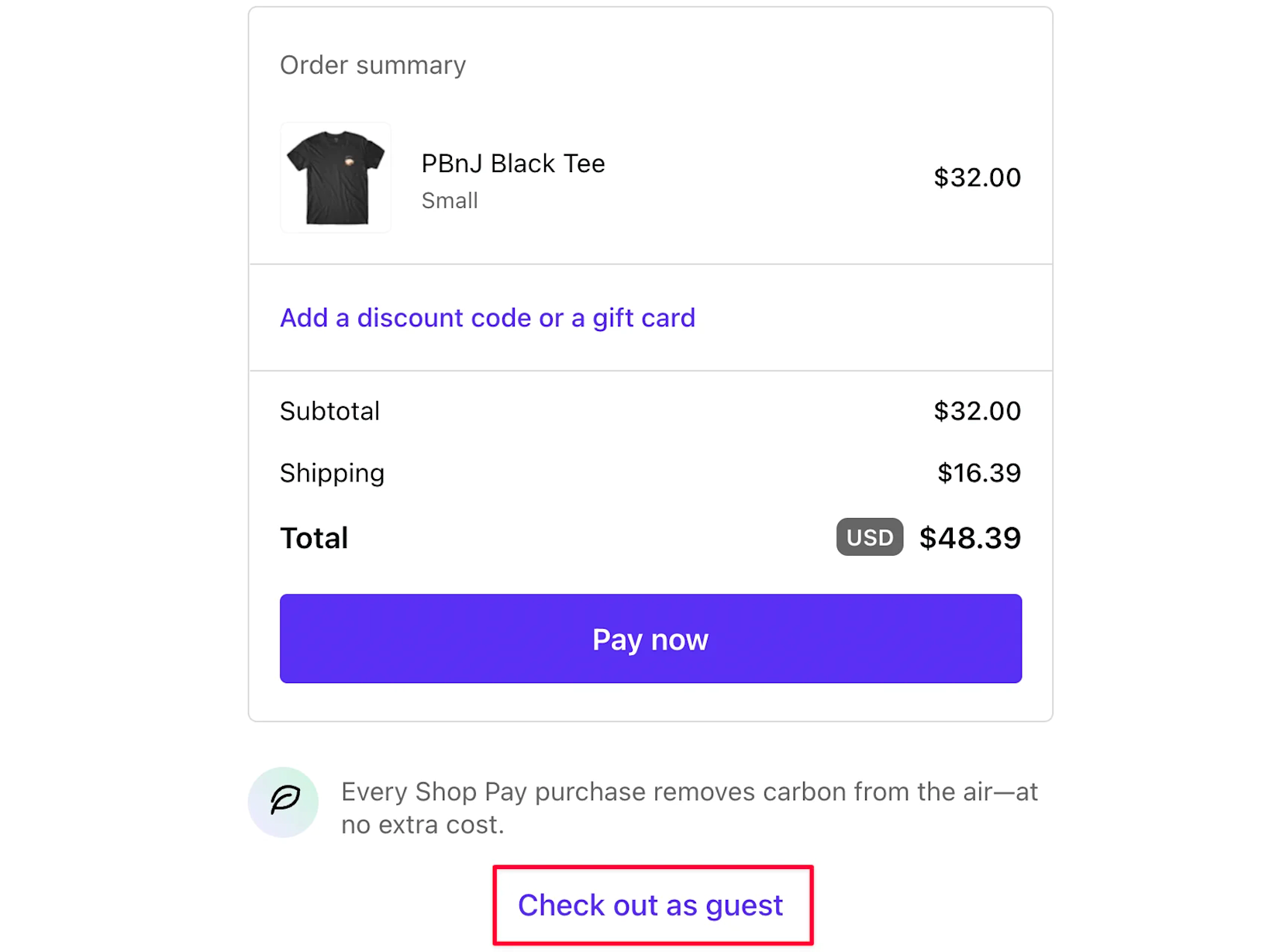
On the Ketnipz merch store, users can choose whether to check out as a guest or returning customer. Guests have a standard checkout process, while returning fans of the brand can sign in for a fast checkout.
3 common mistakes to avoid when designing checkout pages
- Asking for unnecessary information
- Hiding shipping and tax information until the final step
- Not optimizing for mobile devices
These three common mistakes prevent a great checkout experience.
1. Asking for unnecessary information
Requiring the customer to supply more than just the necessary information can lead to increased friction and dissatisfaction. Extra info should be optional, such as survey questions or demographic information.
2. Hiding shipping and tax information until the final step
Hiding costs until the last step can lead to customer resentment and lost sales. According to a report from Coresight Research, extra costs are the biggest reason customers abandon online shopping carts.
Prevent last-minute fees and shipping costs by clearly disclosing all charges upfront, eliminating surprise charges during checkout
3. Not optimizing for mobile devices
If your online store and checkout pages aren’t responsive and mobile-optimized, you’re missing out on a significant portion of the online shopping market. Consumers' growing reliance on mobile devices for shopping shows the need to develop user-friendly and aesthetically pleasing experiences for their mobile websites and applications.
Reduce abandoned carts with Shop Pay Installments
With Shop Pay Installments, you can offer customers flexible payment plans at checkout and lower abandoned cards on larger purchases by up to 28%. Increase average order values and turn more browsers into buyers today.
Checkout pages FAQ
What is cart abandonment rate and how can checkout pages reduce it?
Cart abandonment rate is the percentage of users who did not complete a transaction on an ecommerce website relative to the total number of initiated transactions. The best checkout pages reduce cart abandonment rates by:
- Providing a smooth and efficient experience
- Keeping the process simple
- Building trust with the user
- Offering multiple payment options
- Giving guest checkout options
- Ensuring the process is mobile-friendly
Should I offer guest checkout or require account creation from customers?
It’s best to offer a choice between guest checkout and account creation. This ensures one-time shoppers receive a fast and efficient checkout, while repeat customers can skip form fields to expedite their purchases.
How can I make my checkout page mobile-friendly?
Make your checkout page mobile-friendly by:
- Reducing the number of pages, steps, and form fields
- Displaying total pricing prominently throughout the process
- Eliminating pop-ups
- Using large imagery and text
- Using buttons instead of links
What are the types of checkout pages?
The two types of checkout pages are one-page checkouts and multi-page checkouts. Single-page checkouts include all steps in the transaction process on a single page, while multi-page checkouts spread it out across multiple stages.
Read More
- Guest Checkouts: Definition, Benefits, and Best Practices
- One-Page Checkouts: Definition, Benefits & Optimizations
- 12 Checkout Process Optimization Tips to Increase Ecommerce Revenue
- 11 Ecommerce Checkout Best Practices: Improve the Checkout Experience and Increase Conversions
- What 1-Click Checkout Can Do for Your Small Business
- How to Optimize Your Mobile Checkout Flow